As always. I will give you guys a quick recap of what’s been going on in our group as a whole. Its my pleasure to tell you that our game is progressing in a satisfying direction and our teamwork is going better than ever. Unfortunately we lost another team member which means a lot more pressure on our programmers. How does this affect us, the graphical members?
Well, in order to make it easier for the programmers. We will try to get our art done as soon as possible as well as making it as easy as we possibly can for the programmers. Ive talked to Bengt, our lead programmer and he have shown me how to put my sprites in visual studio. In order for us to check how our designs look in the game, without having to ask Bengt or Erik for help every time. We hope this will decrease, the before mentioned persons, workload.
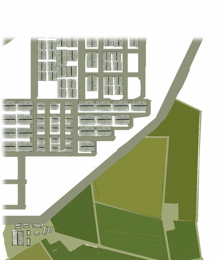
So i have been working on redesigning the map. I’ve been drawing small part of a city, from a birds perspective. For know there just grey boxes with some lines that is there to create a feeling of depth. Ive also been drawing farms and fields of grass. Think Nils Hålgersson. Much of my inspiration is, as i have mentioned in a previous post, gathered from that movie. This is not a hard thing to do but its very time consuming. However i think, i know, i could be more effective at this. Im using photoshop as my main tool. My biggest flaw is that I am still a newbie at photoshop so my main goal this week, and any other week that follows, will be to learn as much as possible about photoshop.
However, because we want to finish our art as soon as possible, we have said that i will degsign the general layout of the map. After this, we will split it in smaller pieces, also known as tiles, and divide the tiles between us graphical students. And we will each clean up and finish our respective tiles. A few examples is to make some of the roofs in a different colors, maybe some cars driving around at the streets but barely visible. We also want the trees and the water in rivers and lakes to move. We also want the mountains to feel closer to the player then the rest of the map. Everything with one goal. To make the map as interesting as we can. If the player perceive it as flat “paper” with no depth and life, we will have failed in that aspect. The challenge in this is: not to do to much. The player should still clearly see the avatar and the enemies. My thoughts on this is to make the map in a different level of the grey-scale than the avatar and enemies. Everything will have a blue tint and we will implement a layer of low-altitude clouds that wont be able to interact with the player in any way. It will only act as an extra separator between the player and the world far below.
Below, youll see a quick design idea and a small part, of the map.